折线图plot
plt.plot函数:
plt.plot(kind='line', ax=None, figsize=None,
    use_index=True,
    title=None,
    grid=None, legend=False,
    style=None, logx=False, logy=False, loglog=False,
    xticks=None, yticks=None,
    xlim=None, ylim=None,
    rot=None,
    fontsize=None, colormap=None, table=False, yerr=None, xerr=None,
    label=None, secondary_y=False,
    **kwds)
参数含义:
series的index为横坐标, value为纵坐标
kind → line,bar,barh...(折线图,柱状图,柱状图-横...)
label → 图例标签,Dataframe格式以列名为label
style → 风格字符串,这里包括了linestyle(-),marker(.),color(g)
color → 颜色,有color指定时候,以color颜色为准
alpha → 透明度,0-1
use_index → 将索引用为刻度标签,默认为True
rot → 旋转刻度标签,0-360
grid → 显示网格,一般直接用plt.grid
xlim,ylim → x,y轴界限
xticks,yticks → x,y轴刻度值
figsize → 图像大小
title → 图名
legend → 是否显示图例,一般直接用plt.legend()
最简单实例:
#导入Matploylib库
$ from matplotlib import pyplot as plt
#在notebook中画图
$ %matplotlib inline
#画布上画图
$ plt.plot([1,2,3],[4,5,1])
#在画布上显示
$ plt.show()
添加标题,标签:
from matplotlib import pyplot as plt
%matplotlib inline
x = [5,2,7]
y = [2,16,4]
plt.plot(x, y)
plt.title('Image Title')    #图片的标题
plt.ylabel('Y axis')        #坐标轴Y轴
plt.xlabel('X axis')        #坐标轴X轴
plt.show()
从python matplotlib库导入样式包,然后使用样式函数:
from matplotlib import pyplot as plt
from matplotlib import style

style.use('ggplot')
x = [5,8,10]
y = [12,16,6]
x2 = [6,9,11]
y2 = [6,15,7]
plt.plot(x, y, 'g', label='line one', linewidth=5)   # 指定为折线
plt.plot(x2, y2, 'r', label='line two', linewidth=5)
plt.title('Epic Info')
plt.ylabel('Y axis')
plt.xlabel('X axis')    #设置图例位置
plt.legend()
plt.grid(True,color='k')
plt.show()
实例:
ts = pd.Series(np.random.randn(1000), index=pd.date_range('1/1/2000', periods=1000)) # pandas 时间序列
ts = ts.cumsum()
ts.plot(kind='line',
       label = "what",
       style = '--.',
       color = 'g',
       alpha = 0.4,
       use_index = True,
       rot = 45,
       grid = True,
       ylim = [-50,50],
       yticks = list(range(-50,50,10)),
       figsize = (8,4),
       title = 'TEST_TEST',
       legend = True)
# 对网格项进行更加细致的设置
#plt.grid(True, linestyle = "--",color = "gray", linewidth = "0.5",axis = 'x')  # 网格
plt.legend()
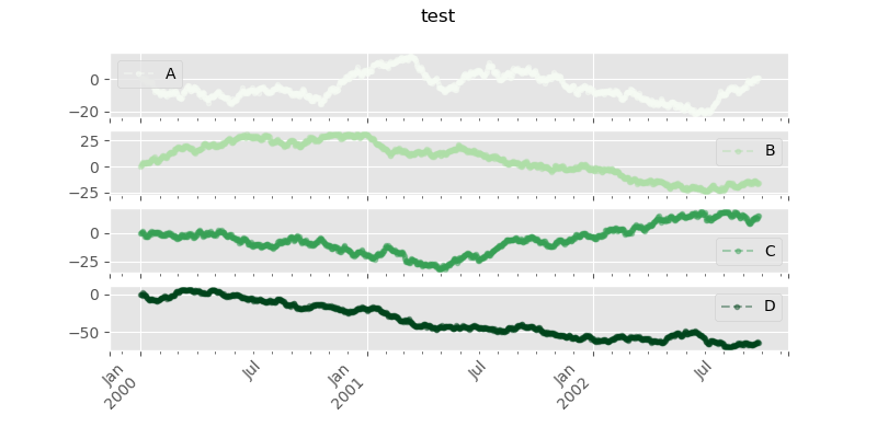
# subplots → 是否将各个列绘制到不同图表,默认False:
df = pd.DataFrame(np.random.randn(1000, 4), index=ts.index, columns=list('ABCD')).cumsum()
df.plot(kind='line',
       style = '--.',
       alpha = 0.4,
       use_index = True,
       rot = 45,
       grid = True,
       figsize = (8,4),
       title = 'test',
       legend = True,
       subplots = False,
       colormap = 'Greens')
legend为False图像:
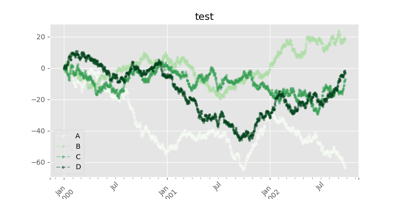
legend为True图像: